Vignette#
[1]:
from matplotlib_radar import radar_chart
import numpy as np

# Set seed to generate consistend plots
np.random.seed(43)
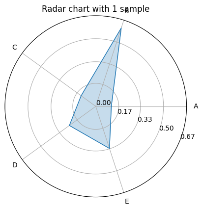
Create radar chart with one sample#
[2]:
radar_chart(
    label=["A", "B", "C", "D", "E"],
    data=np.random.rand(5),
    title="Radar chart with 1 sample",
)
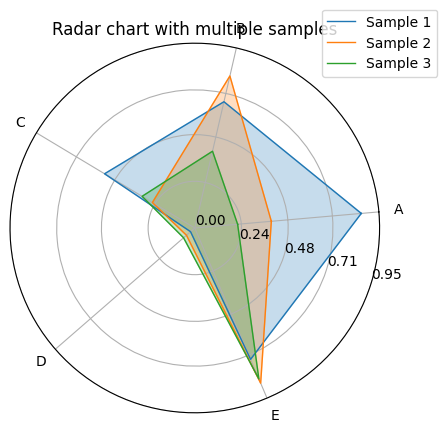
Create plot with multiple samples#
Provided data attribute must be a dictionary of arrays with keys being the sample labels.
[3]:
radar_chart(
    label=["A", "B", "C", "D", "E"],
    data={"Sample 1": np.random.rand(5), "Sample 2": np.random.rand(5), "Sample 3": np.random.rand(5)},
    rotation=5,
    title="Radar chart with multiple samples",
)
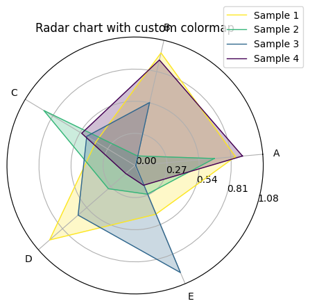
Choose colormap for plot#
Not only qualitative colormaps (like tab10 or Accent) are supported. matplotlib-radar also supports sequential colormaps with continuous values.
[4]:
radar_chart(
    label=["A", "B", "C", "D", "E"],
    data={
        "Sample 1": np.random.rand(5),
        "Sample 2": np.random.rand(5),
        "Sample 3": np.random.rand(5),
        "Sample 4": np.random.rand(5),
    },
    rotation=5,
    title="Radar chart with custom colormap",
    cmap="viridis_r",
)
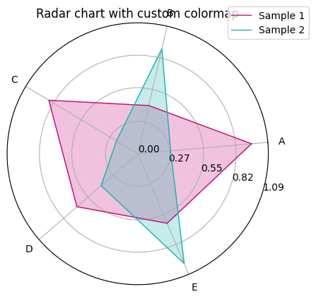
[5]:
radar_chart(
    label=["A", "B", "C", "D", "E"],
    data={"Sample 1": np.random.rand(5), "Sample 2": np.random.rand(5)},
    rotation=5,
    title="Radar chart with custom colormap",
    cmap=["#C70E7B", "#1BB6AF"],
)
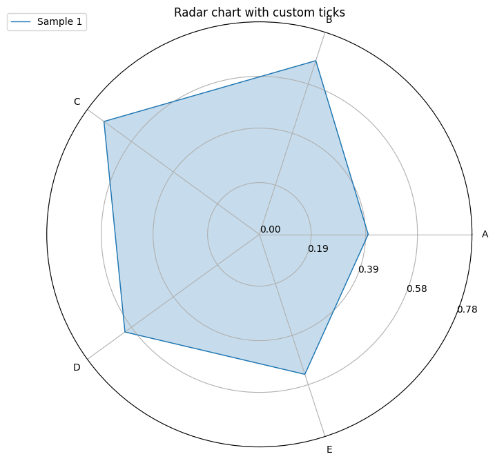
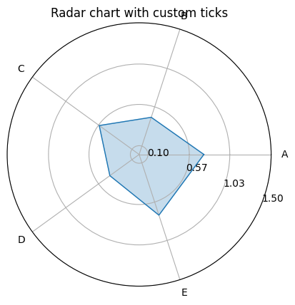
Customize minimum, maximum and tick placement#
[6]:
radar_chart(
    label=["A", "B", "C", "D", "E"],
    data=np.random.rand(5),
    title="Radar chart with custom ticks",
    vmin=0.1,
    vmax=1.5,
    ticks=2,
)
Access matplotlib axes#
[7]:
import matplotlib.pyplot as plt

fig = plt.figure(figsize=(8, 8))
ax = fig.add_subplot(polar=True)
ax = radar_chart(
    label=["A", "B", "C", "D", "E"],
    data=np.random.rand(5),
    title="Radar chart with custom ticks",
    ax=ax,
    return_axis=True,
)
_ = ax.legend(labels=["Sample 1"], loc="center", bbox_to_anchor=(0, 1))